When my wife and I moved to a new house in the fall of 2022, we tried to get rid of some of the books that were overflowing, in a very unsightly way, our shelves. That meant books that we had already read and didn't want to re-read, or had not read and most likely never would read, and duplicates. Among the latter were two copies of Bleak House. One was a small, beat-up, and generally undistinguished paperback. The other was a hardback, in perfect condition, of a good size, and nicely printed.
So that was an easy decision: out went the paperback.
But six weeks or so ago, when I finally began to satisfy my desire to re-read Bleak House for the first time in roughly fifty years and took up the hardback, I noticed something odd. I had just finished Dombey and Son, which runs to some 900 pages. I was fairly sure that Bleak House was at least comparable in length. But this copy had slightly under 600 pages, though it was printed in a typeface of reasonable size and with comfortable margins. Closer examination discovered this brief and inconspicuous note on the title page: "Arranged for Modern Reading."
The fact that I strongly suspect the internet to be a net harm to society doesn't prevent me from using it and appreciating the fact that it gives me instant access to vast quantities of information. I took a quick look at the Project Gutenberg edition of Bleak House and saw that at least one whole chapter was missing from my copy. Then I poked around for information about this particular edition, published by The Literary Guild, which is a book-of-the-month style enterprise, perhaps meant to be classier. And I found that it is indeed abridged. It is, as I said, a handsome production, with illustrations by Edward Gorey (which may be enough reason for me to keep it). But abridgment of such a novel is unacceptable, indeed a sin, if meant for adult readers.
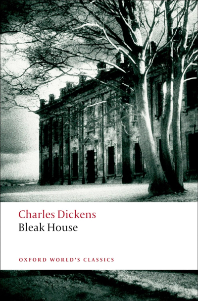
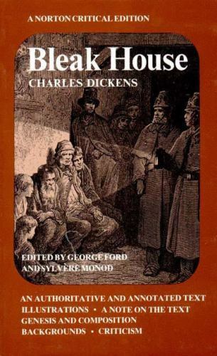
So I checked out a copy from the local library: the Oxford Illustrated Dickens edition, the illustrations being the originals by "Phiz." I hadn't gotten very far in it before I realized that I wanted to buy my own copy. But the OID is out of print, replaced, apparently, by the edition included in the Oxford World's Classics series. That seemed promising. I was also interested in the Norton Critical Edition, which I've found to be very good, and, having just been reading the Wordsworth NCE, I wanted the paraphernalia of notes, background, and criticism. (I thought it was out of print, as Amazon only offered used copies. But I find now that it apparently is very much alive. At any rate I found an inexpensive used copy in good condition.)
I ended up buying both and would recommend either. Quality and size of typeface are increasingly important to me in my old age, as my vision seems to get a bit worse every year. (And it's not something that can be solved with the right glasses; if I live long enough I'll probably need cataract surgery). Both these are very readable. Norton is still using the typeface they've been using since at least the Norton Anthologies which were my textbooks in the mid-'60s, or at least a very similar one. It's remarkably clear as well as compact.
I'm telling you all this because I hadn't quite realized how much detail I was skimming past and ignoring in reading Dickens without notes. He assumes we know something about London geography, about the Chancery courts, about details of life in his time which have had little or no presence in ours for the past century and more. There are many words and phrases that are unintelligible to us, or to me at least, and I venture to say most of us. I hadn't realized how often I contented myself with getting the general drift of a sentence or paragraph and moving on without knowing exactly what had been referred to.
Here, for instance, opening the NCE at random, I find this footnote:
- A ship that is laid up and out of commission, although still afloat.
The note is attached to this sentence in the text:
The good ships Law and Equity, those teak-built, copper-bottomed, iron-fastened, brazened-faced, and not by any means fast-sailing Clippers are laid up in ordinary.
Without the note, you haven't completely missed the sense as long as you get the general idea that the ships are not proceeding. But you certainly miss some precision and some flavor.
Both the NCE and the OWC have such notes, footnotes in the NCE and endnotes in the OWC. I prefer footnotes to the constant page-turning required by endnotes. And I prefer the NCE overall. It has much more supplementary material. Some of that doesn't interest me, including 65 pages of textual notes giving every detail of variation between manuscripts of the novel, almost all of them trivial. But there are also, for instance, selections from documents of the time that go into disgusting detail about the filth of some parts of London in the 1840s, and a section devoted to tracking down real-life sources for some of the characters. I did not know that the detestable freeloader Skimpole is, by Dickens's own assertion, a portrait of Leigh Hunt, though I don't know that Dickens thought Hunt behaved detestably.
Both editions include the Phiz illustrations, but the NCE doesn't have them all. And I wonder about the reproduction of some of them in both. Night scenes are more or less black smears, with little detail visible. But maybe that's my old eyes. Also, the maps are better in the OWC.


Leave a reply to Stu Cancel reply